


"I'm not sure what to do with my hands"
The Ballad of Ricky Bobby

NSR.
(That means ‘not sneaker related’ for those of you non-NTers)
(‘Non-NTers’ are people who weren’t on Niketalk forums back in the day)
But yea, this post doesn’t have anything to with sneakers.
As a kid, I was always amazed at the art that skateboard companies were dropping…any time I earned a dollar or two, I’d try and get my parents to take me to the local (30 miles away) skateshop so I could buy a sticker. Of which, I’d collect, more than stick.
I know a lot of it was based on bootleg culture…kinda like borrowing inspiration from popular designs out in the world, but tweaking them a bit in order to establish independence. Sometimes it worked, other times it came off as cheap and unmemorable.
I remember a lot of the early decks that my dad and I built and messed around with has *strong* personalities…the Bones Brigade in particular focused almost solely on skeletons and other means of semi-disturbing imagery (for the 80’s). The funny part is, I think, for most of us who were there, we saw it as anything but disturbing. It almost became a symbol of comfort. Which, I suppose, is what happens when you begin to identify with a nascent subculture. The symbols and design become familiar and…safe.
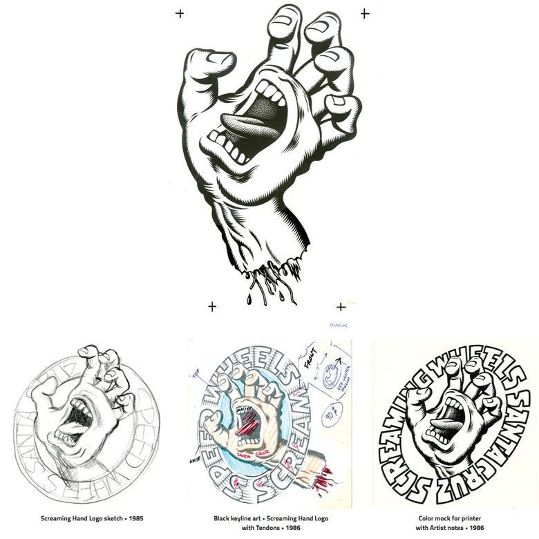
Take, for example, Rob Roskopp’s first skateboard:

One morning in…probably…1987, around 7 am, there was a knock at our trailer door. It was two skater kids from the trailer park that were looking for some dough. These kids knew my dad was on the lookout for a used skateboard deck and offered him a slightly used Roskopp for $7. He got his wallet out and said '$6’ and that was it. The first time I ever saw this grotesque face was when I was 7 years old. It was beautiful. And every time I see it, now, I think about the trailer I grew up in and my early interest in skateboarding. It might not be the first time I ever came across the artist, Jim Phillips, but it is what I remember most vividly.
In 1988 my parents took me to Santa Cruz for the first time, where we went to various skateshops and skateparks, and seeing random Jim Phillips ‘Santa Cruz Skateboards’ art pieces on stickers absolutely blew my mind. I didn’t *know* they were illustrated by Phillips, but this is the first time this stuff started to congeal inside my brain.
The art of Jim Philips came to represent several different periods of my life…as…my perceived epicenter of skateboarding culture started and ended in Santa Cruz. And when I ended up going to UC Santa Cruz a few years later, I’d say I developed a better understanding of it all. And when I moved to New York after college, I choose Jim Phillips and Golden State Warriors gear to represent the more relatable facets of my roots.
So…a Santa Cruz spot logo. The SC wave. Roskopp decks. Slasher and Roadrash comic books. Natas Kaupus. Corey O’brien. And the screaming hand. In my humble (and often wrong and uneducated and ill-informed) opinion, Jim Phillips’ screaming hand is the single greatest logo ever created.
Why?
No reason. Other than the fact that I just really, really, really like it.
I always came to associate it with frustration. Or angst. Counterculture. Or rebelling against the status quo. Just a general undertone of instability. All of the different things that skateboarding represented at the time. In later years, I’d almost equivocally associate it with Rage Against the Machine and Run the Jewels…just pure existential angst. But…as much as I’ve always enjoyed it, I never really knew the impetus behind it. So I googled it. And found an interview with Jim Phillips. And this is what he said:
Where does the Santa Cruz Screaming Hand come from?
The Screaming Hand was first created in 1985 and immediately connected with skateboarders worldwide.
…
Where did Jim Phillips get the inspiration for the Screaming Hand?
"I’m often asked where I got the idea for the Screaming Hand... like I had a store where I could get images. Sometimes an idea just pops in my mind, and I’ve trained myself to be receptive. Screaming Hand dates back to high school where I liked to spend my time drawing epic surfing and skate- board pictures and give them to my friends. In typical surf scenes, I would draw a big wave and a goofy surfer with sight gags like circling shark fins or a clenched hand sticking out of the water like a drowning guy. That intrigued me after I saw a drowned guy at the beach, snot coming out of his nose after some men tried to revive him, the first dead person I ever saw. Stuck in my mind, I drew the clenched hand on my book covers and notepads. Fast forward, and NHS is forming a wheel line and asked for a logo for Speed Wheels Santa Cruz. As I sat at my drawing table and clenched my left hand, I penciled a sketch, thinking about how powerful the hand is, how artists have used it in gestures to express emotion. Then I thought about it being even more expressive if it had a mouth right on the palm, and how much more if it was screaming! I got pretty worked up and knew my drawing would make a cool logo, though it took some time to talk the manager into it. We made stickers and T-shirts, and soon the Screaming Hand proved itself as a powerful icon that certainly earned its own way."
…
The Screaming Hand is a timeless skateboarding symbol that stuck through generations of old and new school skateboarders. Today, it is probably the most recognizable graphic in skateboarding history.
After reading that the idea came to him the first time he saw a dead body…made it all the more angsty for me. And then some other questions: Who was this dead surfer? Does his family know that his death sparked one of the most recognizable graphics in skateboard history? And *why* did a logo born out of DEATH become one of the most recognizable graphics in skateboard history?
Fast forward 20-something years, and the music I find myself most attracted to can best be described as ‘middle aged angst’ music. Top artists of this genre: Run the Jewels, Rage Against the Machine, and Body Count.
I know, I know, Rage hasn’t released anything in 20 years, and Body Count is much of an acquired taste. But. Despite vast commercial success - Run the Jewels is also a bit of an acquired taste.
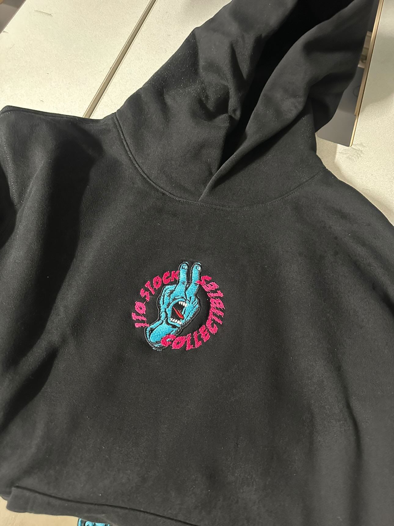
So. Sons of Black Maria and I are trying to come up with a logo for our passion project: 1 To Stock collectibles. It’s a project born within the pandemic, when just about everyone in the world is feeling some sort of angst. Anger. Whatever the hell you want to call it.
We’re both putting together sketches and ideas and nothing seems to be hitting. It’s frustrating. But, I guess, that’s part of the process.
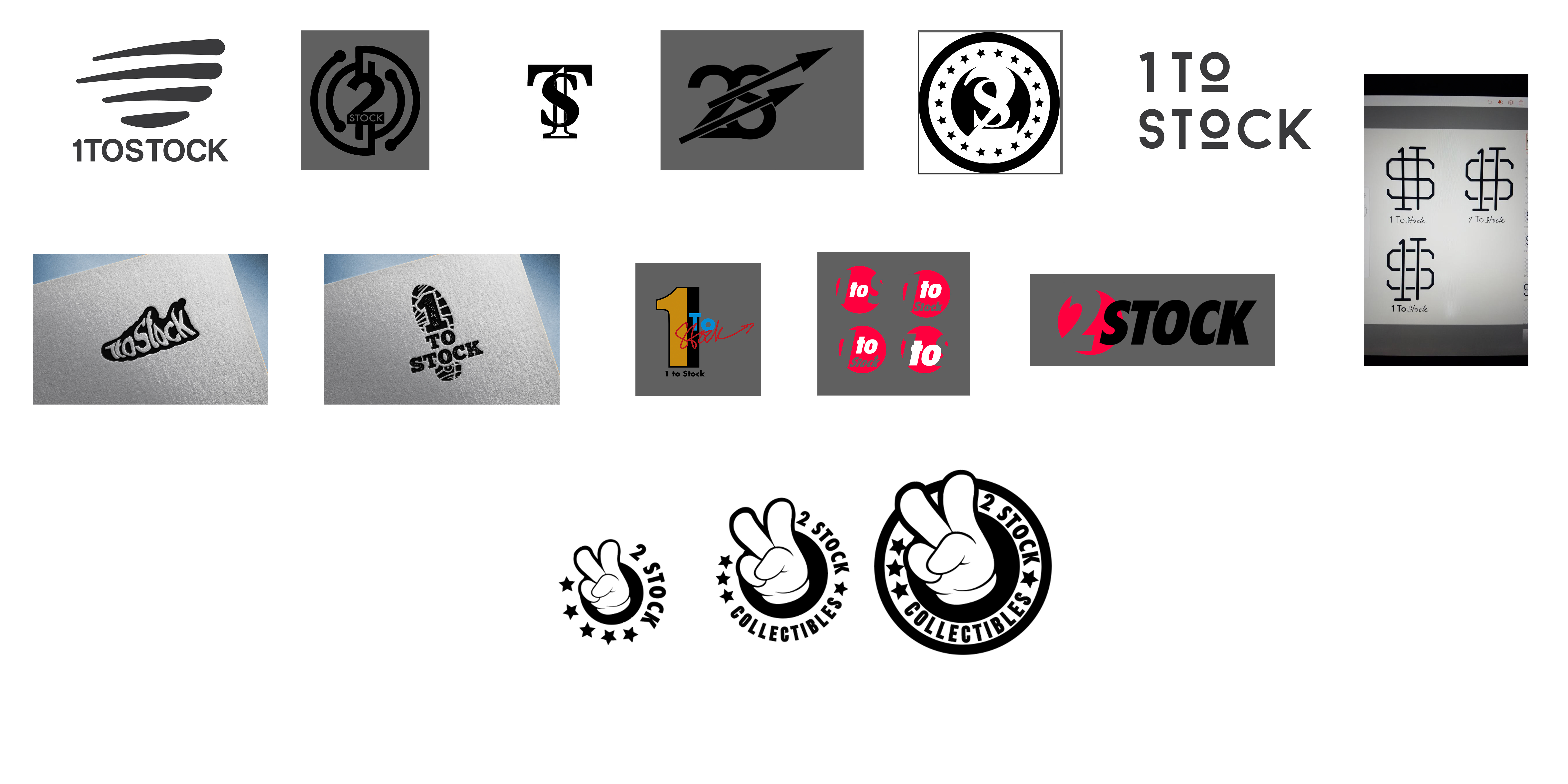
And then we find that we are both fans of Phillips’ artwork….

A few iterations later, and this is what we’ve got:

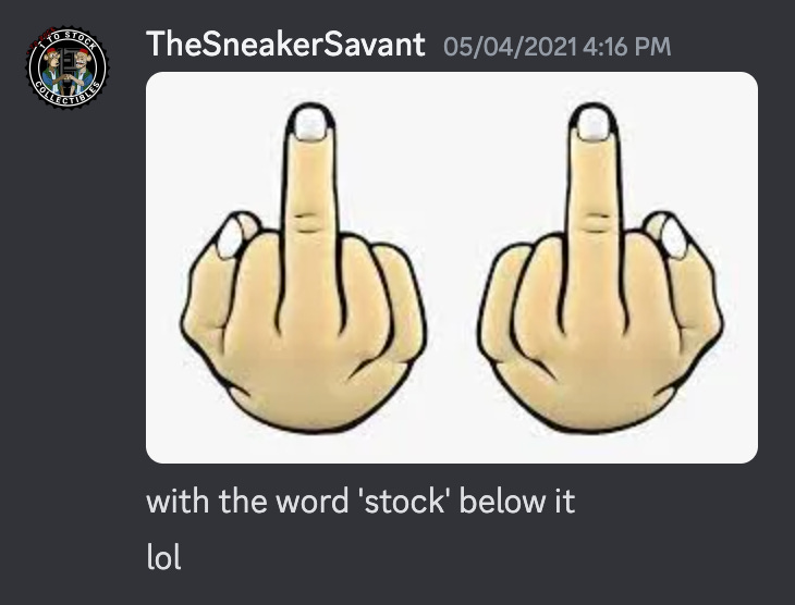
I showed a trusted friend the logos and he said…’wait, you want your logo to say ‘fuck off?’ Isn’t that a little aggressive? Ech. Yeah, I guess. Back to the drawing board. (To be clear, we were in the midst of creating comic book style art for a client. And we were trying to put our stamp on it. So we were trying to add a touch of tongue-in-cheekyness)
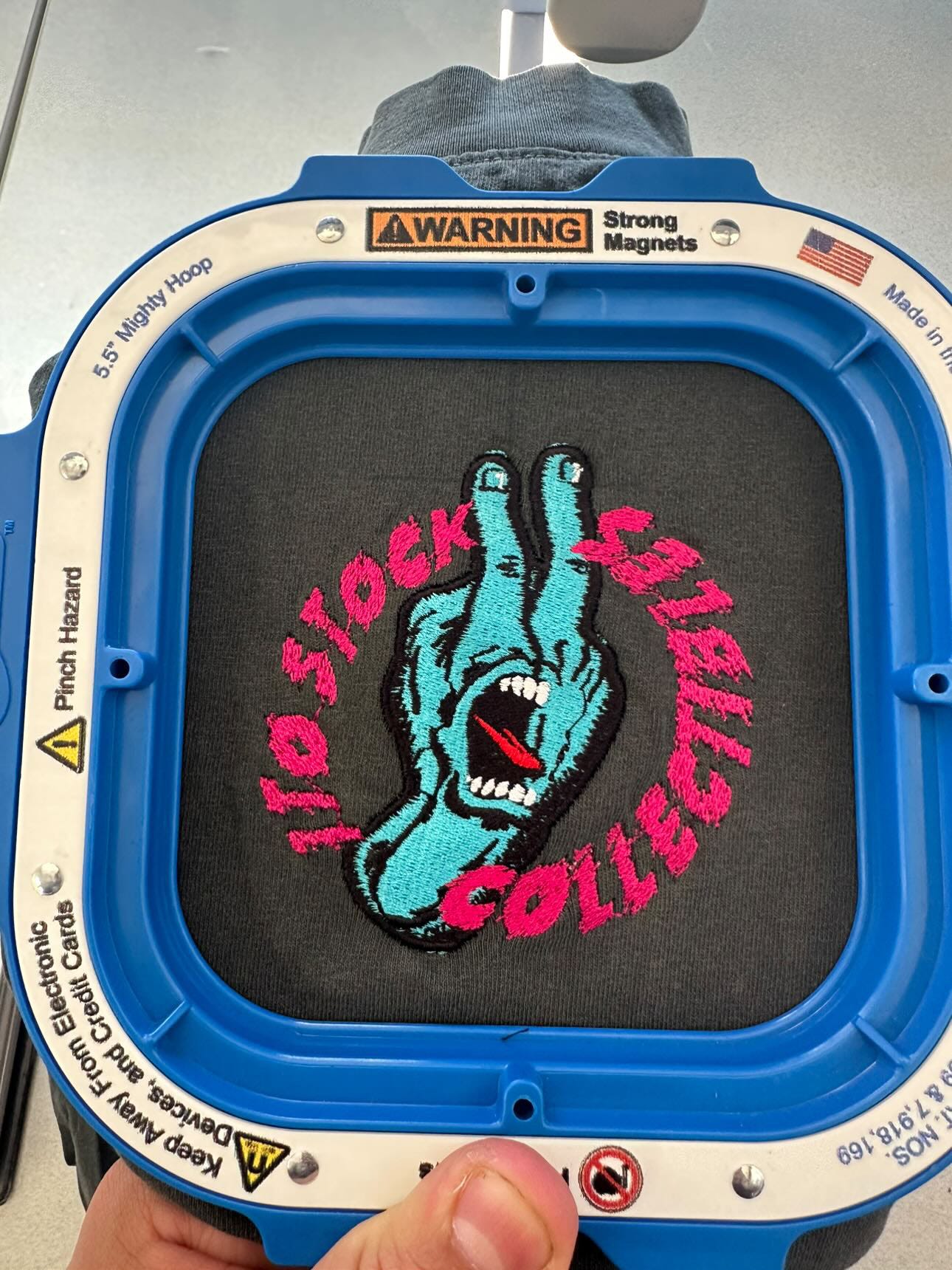
Thing is, though, these weren’t the logos we ended up using. We ended up using something a bit more…safe…a bottlecap/seal that almost looks like a dollar sign. A GREAT logo IMO:

This primary logo, above, is professional and I think it’s classy and comes out great on cards and comic books and pieces of printed material - the main medium of our expression. But, I guess as a secondary logo…can we steer it back towards the angst? I wanted to explore a bit more about the idea of *why* the angst resonates so deeply…
I think…a big part of skateboarding, and rock music, and hip-hop, and sneakers…they come from this idea that there’s something wrong with a concrete jungle and a sort of menacing angst is the preferred method of expression in such an environment…almost like a ‘king of the (concrete) jungle’ type posturing that occurs.
And so…I guess…with our secondary logo design, we wanted to express it more directly, to channel that raw, visceral feel. It's not just about being rebellious for the sake of rebellion; it's about embodying the spirit of dissent that is so integral to the cultures that we’re drawn to. It's about voicing the undercurrents of dissatisfaction and the craving for authenticity in a world that often seems homogenized and sanitized.
We opted for a design that wasn't just a retread of nostalgia, but something that spoke to our interest in the counter of corporate culture.

It’s more of a defiant logo, I think, than the original. The hand is reversed with the British ‘Fuck Off’ finger arrangement in the classic Phillips colorway. It’s a logo that’s meant to be more than just a brand identifier; it’s meant to be a statement, a symbol of the resistance inherent in the creative communities we draw our inspiration from.
The funny thing is, Sons and I have never actually met in person. He lives in Spain and I live in California, but we’ve somehow managed to collaborate on several epic projects in a way that highlight our commonalities.
So, when you look at our secondary logo, perhaps it might seem aggressive or too bold for some. But for us, and for many who resonate with the cultures we admire, it's a powerful affirmation of identity and purpose. It encapsulates the challenge to the norm, the push against boundaries, and the relentless pursuit of individual expression. In that challenge, we find a kind of beauty, raw and unfiltered, like the very subcultures that inspire us.
Through this journey of design and re-design, what remains clear is that our logos, much like our projects, are not just about business. They are about expression for those who feel overlooked or undervalued by mainstream narratives. It’s about crafting a place where the spirit of belonging and the angst of the world prevails…!